Sunday, July 6, 2014

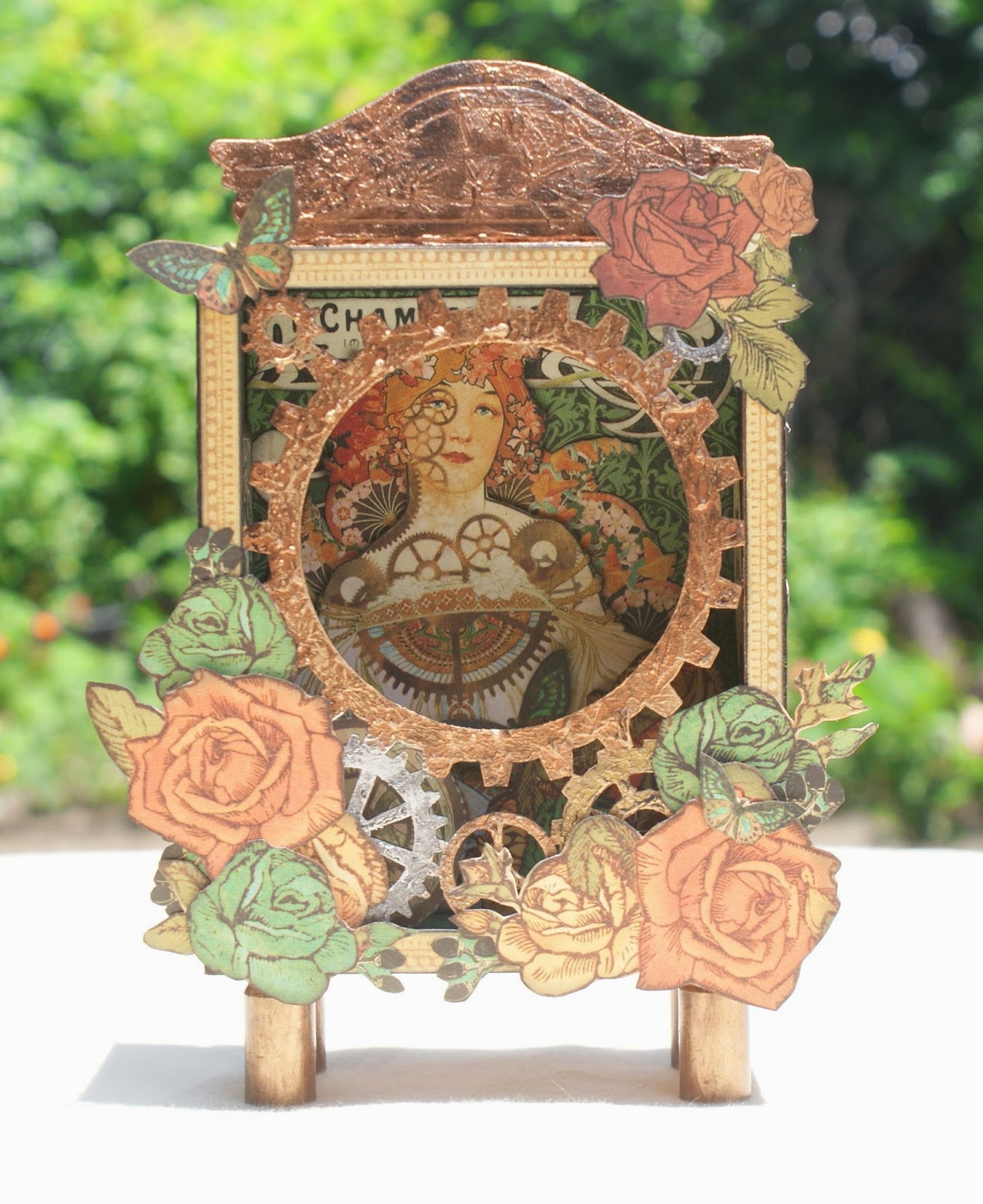
Graphic 45 Steampunk Debutante Shrine

Hi everyone! I almost forget to share one of my favorite projects with you all. I made a Steampunk Shrine a few weeks ago, but had been too busy to post and then I simply forget all about it. So today, I saw it in a corner, covered with scraps from other projects and thought I'd share it ( before I forgot again, hehe).


I started off with Sacrafter's Gears Shadowbox and covered it with Graphic 45's Steampunk Debutante papers. The gears were painted with metallic puffy paints and distressed with black gesso. I simply dabbed the gesso on top and then rubbed some off with my fingers. This creates a cool, grungy affect.I did the same technique on the chipboard pediment from Tim Holtz.


Look at the pretty Steampunk lady inside. I fussy cut several images and layered them over one another to decorate the inside of my shrine. 


I love the way the sides turned out. Again, these are all fussy cut pieces just layered together to create this design. It sort of reminds me of Tattoo art, don't you think?


From this angle, you can see some of the fussy cut images inside. It's hard to see all the details but there is a lot of layering going on.


The feet of the shrine are empty bullet casings adhered with E6000. I used my fingers and dabbed some of that coppery puffy paint and then grunged them up with the black gesso. I think the feet look so cool!!!


And here's the back of the shrine. I used one of the Steampunk frames and added mini gears to her hair. I also added glossy accents to the mirror eye to give it a realistic look. Then I just added a fussy cut butterfly to the flowers on the bottom left hand corner, and that's it.

Being a lover of all things Steampunk, it's only natural I fall in love with this piece. Almost everything I make ends up in someone else's home. But this puppy is all mine and I can't wait to add it to my display case! Hope you all like it as well and thanks so much for stopping by!

I'll see you all real soon...

Thursday, June 26, 2014

12 Tags of 2014, June

Hi guys! It's been a couple of weeks since I posted on my blog, but I've just been super busy. The kids are on summer vacation and I've been putting in a lot of hours at work. So that  leaves me with only a few hours here and there to craft or do anything else, for that matter! Don't you just hate it when life gets in the way of crafting, lol? Well, I did manage to squeeze in my tag this month with just a few days to spare. Let me know what you think!

 
Tim showed us a really cool way to use our stencils and Distress inks to create a watercolor background for our tag. This was my second try since I didn't like the way the first one turned out. I guess it's because I don't have any of the mini ink pads and it was hard applying several colors onto the stencil without it turning all muddy. Some of you may know, I have an obsession with all things "Alice" and having just ordered some new stamps from Oxford Impressions, I saw this as the perfect opportunity to play with my stamps.
 
 
I used the harlequin stencil ( which always reminds me of Wonderland), Tumbled Glass, Broken China, Peacock Feathers, and Black Soot Distress Inks to create my background. Then I stamped large flourishes using Versamark Ink and white embossing powder. I randomly stamped small script over the tag with Barn Door Distress ink for a pop of red. I colored Alice with distress inks and a water brush and aged the tag with Vintage Photo.
 
 
The two little wooden toadstools are by Recollections. I inked them with Barn Door Distress ink and sponged a bit of white paint on the tops then I lightly inked them with Vintage Photo. You may not be able to see it all that well, but I also added gold embossing powder on the edges of the tag.
 
 
I used the same colors as my background to ink up the seam binding and then I made the Paula bow and tied it on my tag. I had some cute charms that I thought would go well with my tag so I attached them to the bow using a charm clip. That's it!
 
I love the way my tag turned out and I'm really glad I found the time to participate this month. You still have a few days to play along, so I really hope you'll give it a go. Thanks so much for stopping by. I'll see you all real soon.


Monday, June 2, 2014

"Lady Rose" Cards and Super Cute Mini Layout

Hi everyone! It's been a couple weeks since I posted anything but I've just been so busy with, well...life. For starters, the kids are out of school for the summer and I have a new houseguest. We had torrential rains a few days ago and part of my house flooded. Ugggh, imagine the cleanup! I'm just thankful it didn't get much worse and cause too much damage.Also, I've been working on a commissioned project for the last couple of weeks and it is really taking up a lot of my time. It's actually a very simple, but tedious project which I'm hoping to get done this week. Hey, at least I'm getting paid for it , right?
Well, today I wanted to share with you the projects Kaylah and I created using the June card kit from DiscountPaperCrafts. Yup, we managed to finish them even with all the craziness going on! The June kit is so, so pretty. I know I say that about all the kits, but I just really fell in love with the colors on this one. It features Kaisercraft's Lady Rose collection with it's rich browns and burgundies, and beautiful roses adorn a lot of the papers. It was a fussy cutter's dream using the roses and other images as embellishments. Cathie does such a wonderful job putting these kits together and we barely used anything from our stash to complete the projects. Really, the kit is perfect all on it's own!

 
I love the way this center step card turned out! Everything you see on the card comes with the kit, except the little ribbon on top of the birdcages and of course, the TH Ornate Frame die  used to diecut the frame. I fussy cut the roses, bird and birdcages from pattern paper out of the 6.5 x 6.5 pad and used them to embellish my card. The border pieces on the bottom are diecuts that come in the paper pad. And just look at those colors, so rich and beautiful!
 
 
This card was a bit more simple, but still so pretty. It measures 5 1/2 x 5 1/2  and we distressed all the edges lightly with our distress tool. I fussy cut the corner pieces, roses and crown and even those cute little butterflies. The Wooden Flourish Ornate Plate adds such a wonderful detail to the card. You get a pack of two in the kit and they are so fun to work with. We kept this one in it's original color but Kaylah used some clear embossing powder on it to make it glossy. That kid just loves using the embossing powders, hehe! We added a seam binding bow and pearls from our stash and viola!
 
 
And here is our gate fold card! I used TH Distressed Doily die for the flaps and they turned out gorgeous! The sentiment is a die cut from the paper pad and the roses were fussy cut from the pattern paper. The white roses that come with the kit add the perfect touch to the rose clusters.
 
 
Here's the inside of the card. We layered several pieces of pattern paper and added a fussy cut rose cluster at the bottom. Perfect spot for a sweet message.
 
 
This card also measures 5 1/2 x 5 1/2. Notice the piece of tulle we added between layers of paper? I thought this would add a romantic touch to the card along with all the roses and the ornate oval die cut. The roses were all fussy cut from the paper as well as that corner piece, little bird and butterflies. The birdcage wooden flourish also comes with the kit, in a package of 2. Kaylah embossed it with gold embossing powder and dabbed it with Snow- Tex. Told you she loves her embossing powders!
 
 
 I really fell in love with this page and couldn't bear to cut it so we decided to make a mini layout. It turned out so cute and only measures about 6 1/2 x 6 1/2! We adhered it to a piece of coordinating cardstock from the kit and used only scraps to create it. I did a little bit of stenciling in the background using a homemade modeling paste and TH stencil. I also cut a paper doily in half and used it around my pictures. That pretty ivory trim also comes in the kit and adds beautiful texture to the layout. We used the second wood flourish ornate plate, topped it off with a metal banner piece and added some fussy cut roses and paper flowers from the kit. Perfect!
 
 
So there you have it! Hope you like what we created using the beautiful June Kit. You can get your hands on the kit here:
 
 
Hope you all have a wonderful week and I'll be seeing you real soon!


Thursday, May 22, 2014

12 Tags of 2014, May

Hi everybody, welcome back! Today I want to share with you my take on Tim's May tag. I'm so proud of myself because I finished it with plenty of time to spare. I just knew I had to do it now because I'm going to be crazy busy in the next 2 weeks and wouldn't have the time then. It was a very simple tag this month, I think the hardest part was using all the little trinkets I've been collecting.But why collect them if you're never going to use them, right?  So here's my take on the tag:

Imagine, Create, Inspire tag
 
I kept it pretty simple and followed Tim's lead. I created the background with a combination of Peeled Paint, Wild Honey and Pumice Stone Distress Inks. Then I  splattered some water on the tag to create a mottled look. The tiles were cut out of chipboard and I covered them with bits from the Wallflower paper stash. Before adhering the tiles, I adhered my tag to a piece of burlap paper, a tad bit bigger than the tag. The burlap frames the tag nicely and I really like the way it looks.
 
 
The inspiration for the tag came from a wall hanging I had seen at a store. It just read Imagine, Create, Inspire. I thought that really summed up what we do as crafters, so it would be perfect for the tag. The butterfly tile is just like Tim's, since I really liked the look of the butterfly over the sticker frame. I just  added a chit chat sticker that reads inspire, to complete my title. The little light bulb is for the sparks of creativity and the #5 game piece is just for the month of May. This way I remember what month this tag was for.


The key and keyhole are to symbolize unlocking our talents and opening up our minds to the possibilities. I love those cute little gears, too.They symbolize the gears turning in our heads, working full speed, helping us to come up with new ideas. I used a Philosophy Tag that reads "Imagine" and then used several different Alpha Parts to spell out " Create". The letters were too shiny, so I scuffed them with my sanding block.
 
Well, I hope you like my tag. You still have plenty of time to play along if you haven't already.
 
Thanks so much for stopping by! I'll see you all real soon.

Monday, May 12, 2014

Altered Jar, card in a box, and handmade gift box for Mother's Day

Hi everyone! I hope you all had a wonderful Mother's Day, yesterday. Mine was pretty uneventful ( not that there's anything wrong with that). We're just not big on going out for Mother's Day. I mean, all the restaurants are booked solid, you've got to deal with all the crowds, and really it's just another day in my book. Now, that doesn't mean we don't do gifts. No sir, I better get something good for all the hard work I do all year, lol! And hubby, never disappoints. This year instead of buying me a bouquet of flowers that will only die in a few days, he went out and bought me a garden! Really! He came home from Lowes with tons of beautiful blooms, rose bushes, Casa Blanca Lilies  and spent the entire afternoon planting them all in the yard. Now I can enjoy beautiful flowers all year long! Love that man of mine, hehe.
As for me, I spent the day finishing off the projects  I made for my mom. I am so very fortunate to still have her in my life and she means the world to me. So every year, I try to make something special for her, to show her how much I care. One of the first things I ever made her was a macaroni "portrait" when I was 5 years old. The smile was all lopsided and it definitely didn't look like her, but would you believe she still has it? Well, my crafting abilities have definitely improved since then, so let me share what I made.

Altered Mason Jar

 
My mom really loves to sew but she is always losing her sewing notions. So I came up with a  solution to that problem. I decided to alter a good ol' fashioned mason jar. The lid became a pincushion for her pins and needles and she can open the jar and use it to store her thimbles, tape measure etc... Plus it makes for a cute décor piece, don't you think?


Sewing Theme Card-in-a-box
 
I've been seeing so many of these pop up cards on Pinterest and I just had to give it a try. They look complicated but they are really so easy to make. Of course, I continued with the sewing theme and I used several of my Tim Holtz dies to decorate my card. I used the Ornate Frame die and turned it into a mirror using the adhesive mirrored sheets. I also used the Sewing Room die and part of the Sewing Edge die to create some embellishments. The paper collection I used is by DCWV call the Primrose Stack. It's gorgeous!!


Handmade Gift Box
 
Well, you can't give such a pretty card in just a plain old envelope, right? So I created a cute little gift box for my card.
 
 
See how nicely the card fits in the box and it makes for such a beautiful presentation.
 
 
 Here's a picture of the whole gift set.
 
I'm so happy with the way my projects turned out and my mother loved them! The smile on her face was as big as the one many, many years ago , when I handed her the macaroni portrait. That smile always bring me great joy! Love you to pieces Momma!
 
Hope you all enjoyed my projects and please come back to visit . I'll see you all real soon.


Thursday, May 8, 2014

"Something Blue" Altered Printers Tray

Hello friends! Today I want to share with you a project I created to celebrate my recent wedding anniversary. My anniversary was on April 23 and I celebrated 8 wonderful years of wedded bliss with the love of my life. It really seems like we've been married so much longer though, because Jay has been in my life for over 14 years. What started out as friendship simply blossomed into love over time and I couldn't be happier. So to commemorate 8 wonderful years, here's my latest creation:


I used Prima's "Something Blue" collection and lots of wood and metal pieces I had on hand. I really love the soft colors of this collection and I printed out my pictures in Sepia tone to better suit the color palette.
The Printers tray was intended as  a gift for my hubby, but as you can see, it turned out more feminine than I had planned. " So who is it for really?" he asked. I had to laugh at that, guess I got carried away with all the flowers, hehe. But it did turn out so pretty and it's going to look wonderful hanging on my wall.


Phew! Lots of pictures,  I know. Just wanted to show you close ups and details of all that went into each compartment. Altering printers trays is a lot of work and this one was definitely a labor of love. I hope you like it as much as I enjoyed making it and I thank you so very much for stopping by. Have a great day !


Sunday, May 4, 2014

DiscountPaperCrafts May Card Kit- Masculine cards

Happy Sunday everyone! I'm back to share some cards Kaylah and I created using the May Card Kit from DiscountPaperCrafts. This month's card kit features Echo Park's Reflections paper pad and comes with everything you need to create some fabulous handmade cards. I really love that this kit has a masculine feel to it. Masculine cards can be a bit of a challenge for most of us, but this kit is a great starting point and the colors are just perfect for masculine projects. So let me show you what Kaylah and I came up with:

 
 This is the first card we created with the kit. It's a very simple card to recreate and I just love how the pattern papers look layered over one another. Of course, we had to bust out the Old Jalopy die by Tim Holtz, for this one. We cut it out of chipboard that came in our kit and gave it 2 coats of dark blue paint. We also used a sponge dauber to apply some gunmetal paint in random spots. Then we sanded the die cut to reveal some of the chipboard and inked it with Vintage Photo. This gave it a really rusty , vintage look. We added some Finnabair metal pieces ,that were painted with the same gunmetal paint ,for the "hubcaps". I like how they don't match...it's an old jalopy after all.
 
 
Love the layering on this card. We lightly distressed all the edges of the paper and added a piece of corrugated board for texture. The postcards and stamps were fussy cut from one of the papers and inked with Vintage Photo before adhering them to the card. The main image and sentiment are from the "Life's Possibilities" stamp set, also by Tim Holtz. Lastly, we added a mini paper clip and one of the smaller Adornments arrows.
 
 
I think this one might be my favorite. I was inspired by Tim's January tag, so I incorporated the pocket watch and techniques to create this card. The pocket watch was painted with dark brown paint then dabbed with coppery puffy paint. We used our fingers and made sure not to cover the entire surface. I really like metallic color and the texture the puffy paint creates, when heated. I covered the Alpha Parts with embossing ink and covered with Distressed Powders in Walnut Stain. Then I just randomly dabbed some coppery paint on top of the letters. Pretty cool huh?
 
 
I went for a nautical theme on this one using a stamp set I recently picked up at Michaels. I stamped the image using Memento Ink in Tuxedo Black then colored it with distress inks and a waterbrush. The "waves" were created with Tim's On the Edge Scrollwork die. I die cut 2 strips out of the pattern paper and I layered them using foam tape. For texture, I added a piece of burlap trim and some cheesecloth behind the main image. And of course, I had to add something metal to my card, so I layered a Compass coin over one of the Finnabair metal pieces from the kit. A cute little tag tucked into some jute string completes the look of my card.
 
 
Even though the kit has a masculine vibe, you can still create a more feminine card with the addition of  some girly touches. Here I used some of the floral papers from the paper pad that were in the lighter colors. I added a piece of lace trim on top of the burlap trim from the kit to soften it up a bit. The birdcage is a wood die cut that I inked with Wild Honey Distress Stain and dabbed with a little Snow-Tex for texture. I created the flower cluster using the Petaloo Textured Petals that came in the kit. They're made out of burlap and come in a beautiful shade of green that coordinates so well with the papers. A few die cut leaves and a metal piece cut in halves complete my cluster. I really love the rustic charm of this card!
 
So you see, masculine cards don't have to be a challenge. Cathie, has already done the hard work for you and has put together the perfect kit for your masculine creations. Head on over to DiscountPaperCrafts and get your hands on this great kit before it sells out. And for only $20, it's a great deal!
 
 Thank you so much for stopping by today! I really do appreciate it and I hope you have a wonderful Sunday. See you all real soon.